Entries in cool maps (4)

Sunday
Mar272011

If It Were My Home

This is a fun and interesting site...and easier than flipping through the World Fact Book.

If It Were My Home compares basic stats about average life in other countries. The first level compares all to the US, but you can compare any country here with another.

While many things are unsurprising, there are some shockers.

Of course, I had to compare the US and Germany

It's really no surprise that Germans use less oil and electricity, have more free time, and have a lower birth rate. I was shocked that it was half the oil and 40% fewer babies, but I do know the low birth rate is a major concern here and a big threat to the future of the social system.

However, I'm really suprised that health care spending is almost half that of the US. I know that based on my limited experience, health care (meaning bills for a doctor visit or minor surgery) is much lower than would be the same service in the US, but that's only one piece of what is a very complicated puzzle.

These are all averages and general stats, but it's still interesting to play around. Apparently the French work more hours per year than the Germans and Canadians use more oil than Americans....

via LifeHacker

Sunday
Feb062011

More Fun with Maps

Along the same lines as the international stereotype maps and US States by TV and movies, there are several fun US maps floating around out there right now.  Sure we can argue with a lot of the data and how they're drawn, but these are just for fun. Yes, I'm a bit of a geography geek and love fun maps.

These maps would lead us to some unusual (and completely unsubstantiated) stereotypes... 

Utah is full of very healthy people, who watch a lot of porn and basketball instead of Jeopardy and have the Highest Reported Wellbeing. Must be the green Jell-O they eat...

Illinois wins the prize for being the most average, which they are...pizza lovers of average health level and of average Jeopardy watching, but with the 5th largest GDP, the most robbery and a great interest in Lotto (hmmm...is there a connection?).

Poor Mississippi...growing up 20 years ago in Georgia, which was often ranked 49th in most positive stats and 2nd or 3rd in the bad ones, we often said "Thank goodness for Mississippi!" In its defense, I quite enjoyed the little time I spent in Oxford...great food, art, and bookstores. But the great Mississippi literary tradition is forgotten here, and instead we see the state portrayed as large, pie-eating, churchgoing, football watching, Jeopardy freaks living in a state with the GDP of Bangladesh.

Texas, as usual, is a bit of a contradiction...though it seems to be full of high school dropouts, it has the 2nd largest state economy (on par with Russia's), the most wind power production, and apparently is very well-fed by steak. We could have a whole blog on Texas, of course, and it is a pretty interesting example economically of doing things right. On the educational side, well...TX is kind of a mess right now...but they are doing something right in terms of innovation, business, and jobs. I'm afraid to ask if the autocomplete "Texas Rangers" is for the baseball team, for law enforcement, or for Chuck Norris.

First we have The United States of Shame, showing stats at which each state ranks 50th (or 1st, where it's a negative statistic).

via Neatorama, original and source data at Pleated Jeans


But Ilya Gerna has made a United States of Awesome map to balance out the shame, showing where each state ranks first in something positive.
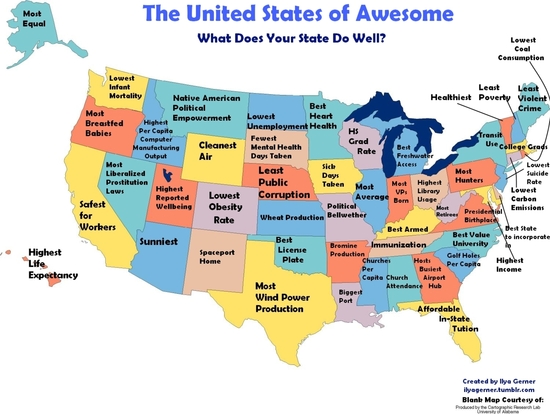
via Neatorama


And a bit less scientific, the map displaying what Google suggests first to autocomplete when the state name is typed into the search function:    
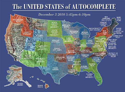
via Strange Maps


One that has been in the news often is the Obesity Map
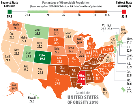
via CalorieLab

And one that might help explain the Obesity Map, the map of foods representing each state
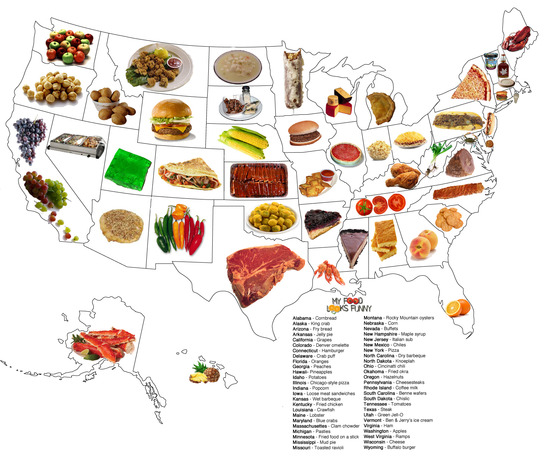
via EdibleCrafts


The original, interactive version is on The Economist website, and also has one by population. Most shocking to me is that Italy has a bigger economy than Russia. I guess it shouldn't be that suprising, but my guess would have been that all the oil and gas and minerals would have put Russia higher.

via Neatorama


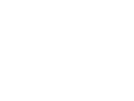
And finally, the map of Jeopardy fans...

via Strange Maps

Saturday
Dec042010

Stereotype Maps

These are fun.... Yanko Tsvetkov has created a series of maps showing countries as their stereotypes. He's from the UK, so there are several maps of Europe, from various view points....

In "Europe According to the Vatican" Swtizerland is shown as "Guards" and Finland as "Jesus Never Went There." The countries also are conveniently color-coded (with shading to denote intensity) as "Righteous People," "Misguided Brothers," and "Bastards."

In "South American According to the USA" we see the "Cuba del Sur" (Bolivia) and the "British Riviera" (Falkland Islands).

Russia is generally depicted by other Europeans as "Big Spenders," gas supplier, or "Bully." However, my favorite Russian one is in "Europe According to France", where it is shown as "Napolean's Dream."  

"Europe According to Gay Men" also is fun, with Sweden shown as "Trashy Dance Music" and Turkey as "Sexy Homophobes." Portugal, the Spanish islands, Greece, Cyprus, and the Dalmatian Coast are collectively shown as "The Federated Holiday States of the Mediterranean," or "F.H.S.o.M."


My two favorites are The World According to USA and The World According to Germany. (Not surprisingly, being an American living in Germany...)

The World According to USA

The World According to Germany


Sunday
Nov282010

The United States in TV and Movies

OK, I'm a big dork and love maps, especially ones that blend together geography and pop-culture.

You've probably seen the one with the US states as Movies before (it made the rounds on The Huffington Post and other sites), but Andrew Shears has done one showing the states as TV shows. I guess "Dukes of Hazzard" is a bit better than "Deliverance" for Georgia, but still not bringing out the state's best!

The United States as Movies  

The United States as TV Shows


via Strange Maps